by Rakesh Pal.
Our Goals:
- Create a unique list of words that appear in a book.
- Create a count of how many times those words appear.
The steps involved
- Download a book
- Load & Clean up the book – PowerQuery
- Analyse the book – PowerPivot
- Present our data – PivotTables/Charts
Download a book.
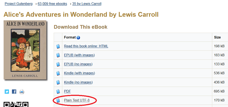
I’m using Alice in Wonderland, which I downloaded from http://www.gutenberg.org/ebooks/11 – the Plain Text version, .txt file format.
Load the book into PowerQuery
Start Excel – I’m using 2016.
Using the Data Ribbon, New Query > From Text

Find the location of your downloaded book. Press OK.
A window will appear – press Edit, as we need to Edit the Data before it can be used.

PowerQuery will open and display the Data from the file we loaded.

Rename your Query to something meaningful.
PowerQuery wndow – we can observe the attempt to load the book.
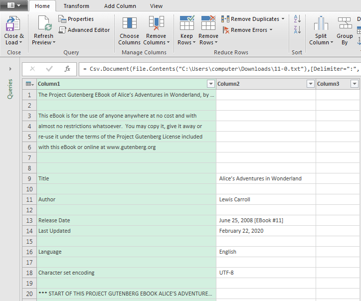
Unfortunately, the book has appeared over 3 columns?!
We’d like to combine all the columns into one, making it easier for us to work from.
To achieve, lets change the way in which we load in the files.
Lets remove the Csv.Document function, and replace it with the Lines.FromBinary function.
Using the Formula Bar, remove the Csv.Document function, leaving the File.Contents function intact.

Don’t press Enter yet!
We’d like to wrap a Lines.FromBinary function around the File.Contents Mcode. See below (NOTE: Please don’t edit the File.Contents(path) part.. My path will be different to your computers, copying it most likely won’t work on your system!)
The Lines.FromBinary function will convert the raw binary contents into a List of text values, and split at line breaks. Useful for what we need.

Press Enter, or click on the Tick icon.
The result:

Our text appears in one column.
The next step is to convert our List into a Table.
We can achieve this by using the Table.FromColumns function.
The Table.FromColumns function takes a List of Lists, and converts them into Table. We’re only using one List in our case.
To create a new Step, use the Add Step button – small fx icon.

Type the following Step into the Formula Bar

Press the Tick icon or press Enter.
It’s good practise to rename your Steps in the Applied Steps box – this’ll make it easier to understand what’s going on as we look back at our work.
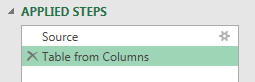
Here I’ve renamed our newly entered Step to “Table from Columns”, which is more meaningful than “Custom1”!
The result of our Table.FromColumns function.
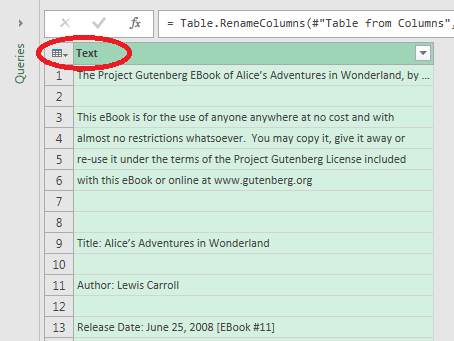
Note: I’ve renamed the Column to “Text” – you can do this by double clicking the Column name, and typing in a suitable name.
Now we can really get started!
Cleaning up our data
Lets lowercase all of the Text.
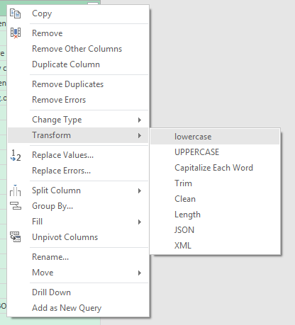
Right Click the Column Name (Text), Transform > lowercase
All of our text has been converted to lowercase.
Lets use Text.Clean to remove all of the linefeeds and non-printable characters. This step may not be necessary, but I’ve included it as a precaution.
Right Click Column Name (Text), Transform > Clean

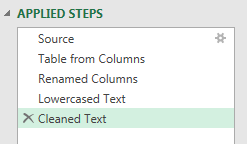
PowerQuery has given our Steps suitable names, as we can see in the Applied Steps window.
Lets remove all unwanted characters, using the Text.Remove function. These include “.” “,” “#” and so on, including numerical values.
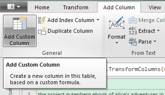
Create a new Column:
Add Column Ribbon > Add Custom Column

Type the following formula into the Custom Column Formula box. I will display the text below, so you can simply copy and paste. Give the new Column a name.
Text.Remove([Text],{“ ’”,”.”,”-“,”,”,”:”,”;”,”*”,”!”,”‘”,”_”,”[“,”]”,”?”,”=”,”(“,”)”,”/”,”#”,””””,”1″,”2″,”3″,”4″,”5″,
“6”,”7″,”8″,”9″,”0″,”*”})
Press OK

The results of our Text.Remove function.
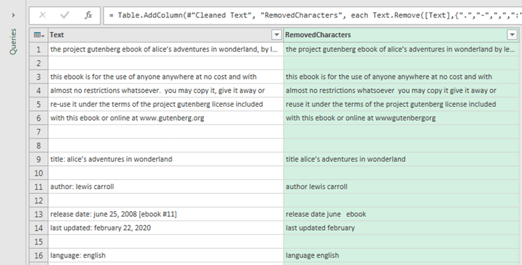
The Text.Remove function removes all specified single characters. You can only specify single characters, not whole words.
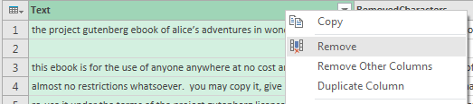
Lets remove our Text Column, as it’s no longer needed – right click on the Text Column name, and Remove.
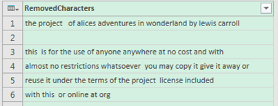
There are some words that I had to manually remove from this particular book. Such as, “http”, “www”, “gutenberg”, and “ebook”.
To accomplish this, we can use the Table.ReplaceValue function.
We can pass the Table.ReplaceValue function a series of text we’d like to have replaced with another – in our case, a blank, or “”.
Right Click on your Removed Characters Column, and select Replace Values

The Replace Values box will now appear. Lets type in the first word, “http”. Leave the Replace With box blank, as want to replace it with a blank.
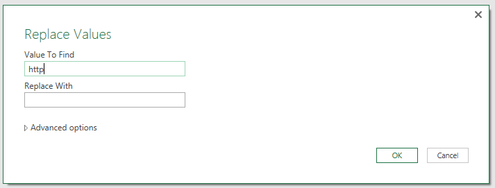
Press OK, and repeat the process for the other words too – “www” “gutenberg” “ebook” etc.
You could rename the Steps in the Applied Steps box if you wish.

Next we’re going to iterate over each row in our Table, and create a List of all the words each row contains.
To accomplish this, we can use the Text.SpiltAny function.
This will split the text at each occurrence of a specified delimiter, in this case a space or “ “, and place all of the words into a List. It will iterate over each row.
Create a new column:
Add Column Ribbon > Add Custom Column
Add the following formula into the Custom Column Formula box. Remember to select a suitable name for the new Column.

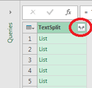
The result

If we look at the area at the bottom of the screen, we can see a preview of the currently highlighted Lists contents.

Lets remove our RemovedCharacters Column.
Right Click the Column, and Click on Remove.
We should only be left with our TextSplit Column.
Lets Expand all of our Lists in the TextSplit Column, to convert the nested lists into one Column.
To accomplish this, press the Expand button to the right of the Column name.
The result

Every word in the book is in one single column.
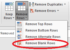
Notice the blank rows? Lets remove them, since their not needed.
We can use the Remove Blank Rows function to do this.
You can find this on the Home ribbon, in the Reduce Rows group.
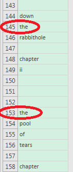
The result – no blank rows left.

If we scan through the Table, we can observe that it contains Duplicates:
To create a Unique List of Words, we’d need to group each word – and then we can count how times that particular word appears.
To accomplish this, we use the Group By function.
You’ll find the Group By function in the Home Ribbon, on the Transform tab.
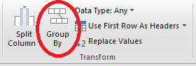
Click it, to bring up the Group By window.
In the Group By selection box, make sure the TextSplit Column is selected. This is the Column that PowerQuery will use to create a Unique List of items.
We can create additional Columns too, which can be useful for analysis and presenting Data.
In our example, we’re going to create a Count Column. Select Count Rows in the Operation box – this will Count how many times a particular word appears in our entire Table.
Press ok.

The result
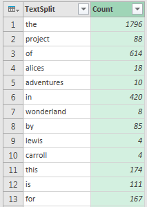
We have a Unique List of Words, and a count for how many times they appear in the book!!!! Mission Accomplished!!!
Analyse our Data
Lets load the Table to the Data Model, where we can create some DAX Measures to help us analyse our Data, and present it in a Data Model Pivot Table.
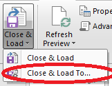
On the top left of your screen, you’ll see the Close & Load button.
You’ll see a small downwards triangle by it – press it, to bring up some more choices.
Press the Close & Load To… option.
You’ll be presented with the Load To window.
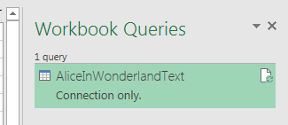
Check the Only Create Connection option, and the “Add this data to the Data Model” option. Press Load.

You’ll see your Query listed on the right hand side of the screen, in the Workbook Queries window – note the “connection only” comment.
Our Data has been loaded into the Data Model.
Lets use PowerPivot to view our Data in the Data Model, and create some DAX Measures.
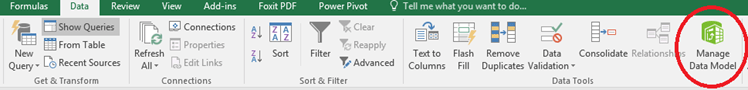
PowerPivot can be accessed by the Data Ribbon, in the Data Tools group.
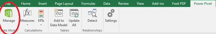
Or from the PowerPivot Ribbon, in the Data Model group
PowerPivot window
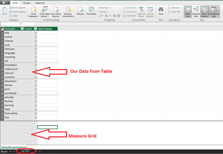
We can view our Data from the Query we made, using PowerQuery, imported into the Data Model.
Below is our Measure Grid, where we can input our DAX Measures.
The Number at the bottom of the screen indicates how many rows are in our Table.
To input in a Measure, select a square on the Measure Grid, and begin typing your Measure. You can also select a square, and copy and paste the Measures I’ve provided below, into the Formula Bar (similar to the Formula Bar in PowerQuery) – pressing Enter will insert the Measure into PowerPivot.
Once you’ve completed entering a Measure, select the empty square below, and continue the same process for entering the other Measures.
Count Unique Words:=COUNTROWS(AliceInWonderlandText)
Count Words:=SUM(AliceInWonderlandText[Count])
Total Words:=CALCULATE(SUM(AliceInWonderlandText[Count]),ALL(AliceInWonderlandText))
% Total Words:=DIVIDE([Count Words],[Total Words])
Our 4 Measures entered correctly.

The currently selected Measure will be displayed in the Formula Bar

Well done, you’ve entered all of your DAX Measures.
Now press the X on the top right corner of the screen, to exit PowePivot and return to Excel.
Present our Data.
It’s time to present our Data.
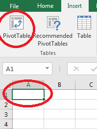
Lets create a Data Model Pivot Table
Click on the first cell, A1, In the corner of the spreadsheet.
Go to the Insert Ribbon, and select PivotTable.
Check the following options
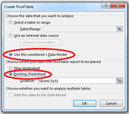
Our Data is stored in the Data Model, hence selecting it to create our PivotTable from. Press ok.
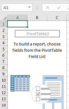
Our empty PivotTable will appear
On the right hand side of the screen the PivotTable Fields window will appear.
We can see the AliceInWonderlandText Table listed.
To see the Fields (Column Names, or Measures) appear, press the small triangle
These Fields can be dragged into the Filter, Columns, Rows and Values areas as required, to construct our PivotTable.

Expanding our AliceInWonderLandText Table.

Drag each of the Fields, as below
Ignore the Values in the Columns section, this will populate automatically.

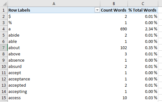
The result
“Row Labels” is incorrect. To fix this, click on any cell in the PivotTable, click on the Design Ribbon, Report Layout > Show in Tabular Form.
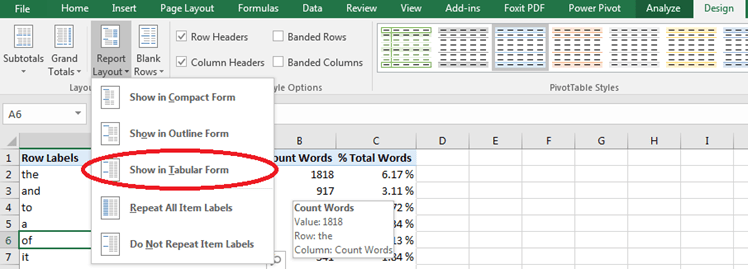
Correct Field Name now appears

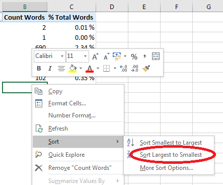
Lets sort the Count Words Field, so the most frequent words appear at the top.
To accomplish this, Right Click on any cell in the Count Words Column, Sort > Sort Largest to Smallest
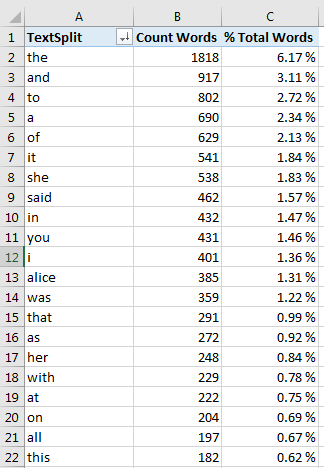
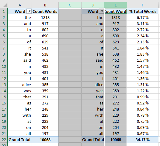
The result (I’ve also resized the 1st Column)
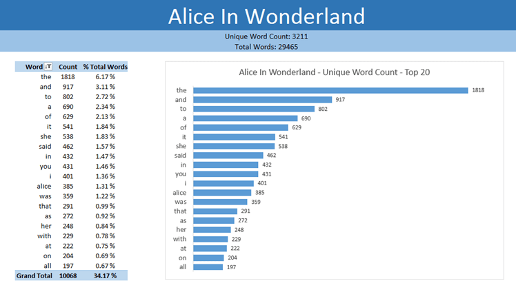
Congratulations, you now have a Unique Word Count!
Lets rename the 1st Column. We’ll also add a Filter – to display the Top 20 Words, as displaying over 3,000 wouldn’t be useful. Though you could skip this step if you prefer.
To accomplish this, press the down arrow icon by the TextSplit Column Name.

This will display a range of Sorting & Filtering options.
Select Value Filters > Top 10….
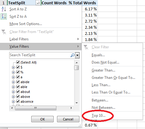
A Top 10 Filter window will now appear.
Replace the 10 with 20. Press ok.

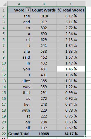
The Result

I’ve renamed TextSplit to Word, and also aligned the Columns centrally.
We’d like to present our Data from the PivotTable as a Bar Chart.
As a rule, whichever Fields are in your PivotTable will appear in your final Chart. However, we don’t want % Total Words to appear in our Chart, but still want it included in the PivotTable. How do we resolve this? By using a workaround. We’re going to use two PivotTables.
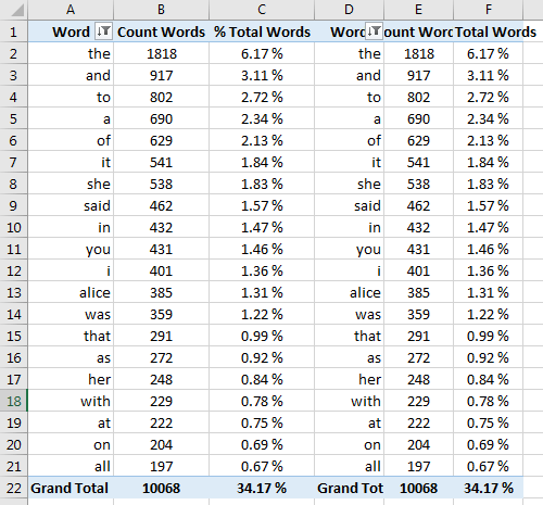
Lets make a copy of our PivotTable
Select any cell on the PivotTable and Press CTRL+A, to select the entire PivotTable.
Press CTRL+C to copy the PivotTable.
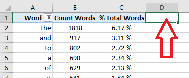
Click on the 1st Cell on the Column next to your PivotTable – D1 in this case
Press CTRL+V to paste the PivotTable
The result
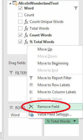
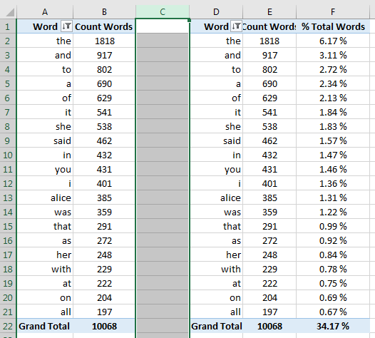
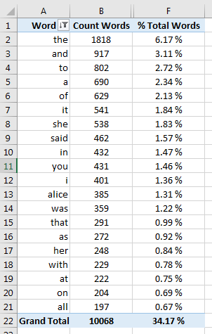
Select the original PivotTable, and in the PivotTable Fields area on the right hand side of the screen, remove the % Total Words Field from the Values box. You can simply drag It away from the box, or click on the small downwards arrow by it and select Remove Field.
The Result

Lets hide some of our Columns.
Select Columns C, D, E – by holding down the CTRL button and hovering the cursor over each Column Cell Reference (the letters at the top) – you’ll see a downwards arrow appear. Click on each of the Columns Cell References to select them.
(I couldn’t capture the downward arrow whilst taking a screenshot)

Entire Column selected.
Whilst keeping CTRL held down, repeat the same proces for Columns D and E.
Right Click one of the Column Cell References – C, D , or E, and Select Hide.
This will Hide all of the Columns we’ve selected.

The Result.
I’ve resized the Columns so the Field Names appear correctly.
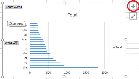
For the numbers to be easier to interpret visually, we can create a Bar Chart.
Select any cell in the Count Words Column.
On the Insert Ribbon, locate the Charts group, and select a 2D Bar Chart. A Chart will appear.

Lets move the Chart and resize it
If you click on the Chart, you’ll see a Green Cross appear on the right hand side – which’ll bring up some options to help you format the Chart to your liking.

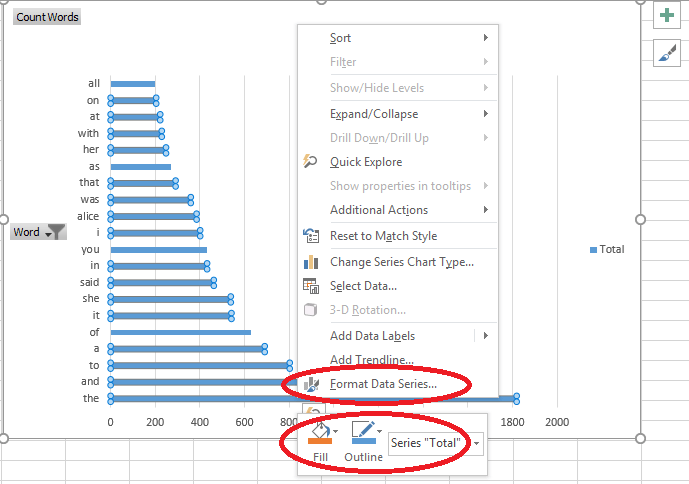
Right Clicking an element of the Chart will also bring up editing options.
For e.g. Right Clicking the Data Bars
Our finished Spreadsheet.
(I’ve added some extra formatting.)

Thank you for reading, and i hope you found the tutorial useful 🙂
